

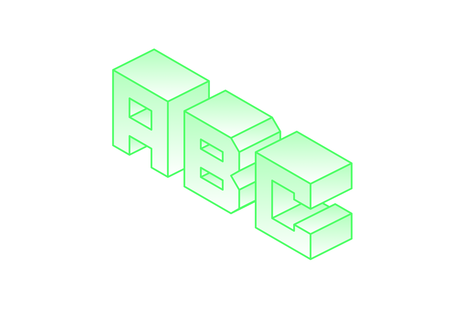
In product design, typography is often underestimated—but it’s one of the most powerful tools to shape user experience and build brand trust. The right fonts guide users seamlessly through interfaces, highlight important information, and create emotional connections. Over the years, I’ve seen how smart typography choices can transform a product’s usability and elevate its overall impact.
In this post, I’ll break down the essentials of typography in UI/UX, including best practices, common pitfalls, modern trends, and how to tailor typography based on your product type. Whether you’re a startup founder or a design lead, mastering these elements can make a measurable different
Why Typography Matters in UI/UX Design
Typography is not just about picking a pretty font. It affects readability, hierarchy, accessibility, and even user trust. For example, in a fintech app I worked on, choosing a clean, modern sans-serif font over a decorative one helped users feel more confident entering sensitive financial information.
Typography acts as a silent guide that makes interfaces intuitive and professional. Every font decision has an impact on how a user navigates and feels while using your product.
Best Practices for Typography in Product Design
1. Create Clear Hierarchy with Font Size and Weight
Use varying font sizes and weights to signal importance—headings, subheadings, body text. This helps users scan content quickly and know where to focus.
2. Stick to a Limited Font Palette
Limit your design to 2–3 fonts max. Mixing too many creates visual clutter and weakens your brand identity. A classic pairing might include a clean sans-serif for UI and a serif for editorial elements.
3. Prioritize Readability and Accessibility
Choose fonts that are easy to read across devices. Make sure contrast, letter spacing, and line height are optimized to meet accessibility standards.
Modern Font Pairings That Work for Digital Products
Here are some go-to type combinations that balance form and function:
- Roboto + Merriweather – Clean and readable for data-heavy platforms
- Inter + Source Serif Pro – Versatile, modern, and accessible
- Poppins + Lora – Friendly and ideal for lifestyle and education apps
Font pairing is not just visual—it’s strategic. The right duo supports your product’s voice.
Common Typography Mistakes in UI/UX
Even great products can feel unpolished when typography is misused. Watch out for:
- Too many styles or weights in one layout
- Low contrast between text and background
- Overly decorative fonts in functional UI elements
- Neglecting line height and tight letter spacing
- No responsive scaling, causing poor mobile readability
These mistakes hurt readability and create friction in the user experience.
Tailoring Typography by Product Type
Typography should reflect your product’s purpose and audience. Here’s how I approach it:
- Fintech, SaaS, Healthcare:
Prioritize clarity and trust with clean, structured fonts like Inter or IBM Plex Sans. - Edtech & Learning Platforms:
Use approachable, warm fonts like Poppins or Nunito to reduce cognitive load. - Ecommerce, Lifestyle, and Brands:
Explore expressive fonts that match your brand story while maintaining usability.
Every product type has a different tone—and typography should align with that.
Final Thoughts: Typography Is Your Product’s Voice
Typography isn’t decoration—it’s design communication. When used with purpose, typography guides users, builds confidence, and shapes your product’s identity.
Whether you’re launching a new app or refining an existing product, intentional typography can have a measurable impact on user engagement and perception.
If you want expert help crafting typography that fits your product’s unique needs and drives real results, I’m here to help.
👉 Book a free discovery call: https://cal.com/uiants/projectdiscussion
Let’s elevate your product with typography that speaks the right language.
